Project: Grace Winter 水姑阿冬 品牌設計提案02
Client: Grace 冬天
"We chose red to represent winter because it aligns well with the client's personality. Although we initially considered using cooler tones to visually connect with the season, the client preferred a warmer color palette to better reflect her character.
This project was an unselected proposal, but we are very fond of it. The official version will be published next year."
“我們選擇用紅色來代表冬天,是因為它能更好地展現客戶的個性。雖然我們曾考慮使用冷色調來與季節意象連結,但客戶堅持希望保持暖色調來傳達她的個性。
這個項目是一個未被選中的提案,但我們非常喜愛它。正式版本將於明年發布。”
--------------------
This is a mockup proposal design for one of my client, the picture in this project does not include any business activity.
The picture is cited from Unsplash.
Photographer: Thời Trang Thái Tuấn

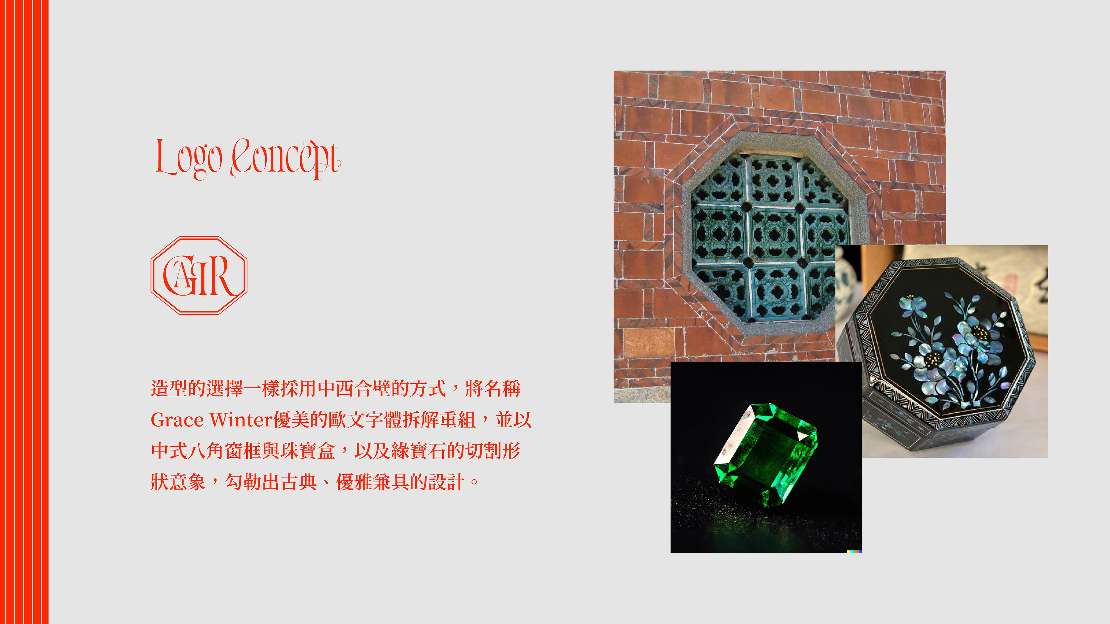
造型的選擇一樣採用中西合壁的方式,將名稱Grace Winter優美的歐文字體拆解重組,並以中式八角窗框與珠寶盒,以及綠寶石的切割形狀意象,勾勒出古典、優雅兼具的設計。
"The styling choice also adopts a fusion of Eastern and Western elements, deconstructing and rearranging the elegant Western typography of the name 'Grace Winter.' This is combined with the imagery of traditional Chinese octagonal window frames, jewelry boxes, and the cut shape of emeralds, outlining a design that is both classical and elegant."


